Pumba Burger
A smash burger joint where every order came in by phone — the worst possible place to order. You shout it over the griddle, someone writes it down wrong, and everything that comes in while the line is busy is simply lost. We built a site where the customer builds the order straight from the menu and closes it with a three-character code. They call, read it out, and whoever picks up already has the whole order on screen.
- Client
- Pumba Burger
- Sector
- Smash burger restaurant
- Services
- UX/UI design, web development, art direction
- Timeline
- 6 weeks
- Tech stack
- Next.js + Tailwind + Vercel
Measurable results.
0 s
The call now takes ten seconds
The order arrives built from the site. The caller reads out three characters and whoever answers pulls the whole thing up on screen.
+0%
More orders outside the rush
The menu can be browsed at any hour, so the orders that used to vanish because the line was busy stop vanishing.
0 errors
No more «was that no onion or no pickle?»
How you want it cooked, the extras and anything taken out travel written into the order, not shouted over the griddle.
From the problem to the live site.
Tap each phase for the detail.
Diagnosing the problem
The phone was the only counter, and a counter cannot be something that gives you an engaged tone. The problem was never a lack of hunger: ordering meant talking, and talking with a griddle behind you means repeating yourself, writing it down wrong and hanging up unsure whether the order is the one you placed. Before anything was drawn, the decision that governs everything else was made: the site would not be a brochure with the menu stuck on it, it would be the counter.
- Home
- Menu
- Customise
- Code
PRESSED
Headings: Archivo Black
Body: Nunito

- Order one-handed, on a phone, in under a minute
- No sign-up, no app, nothing paid up front
- The food photography is the structure, not the decoration
Four screens, and every one pushes towards the order
A screen either moves you closer to ordering or it does not belong. Four were left standing — home, menu, product and code — and the route through them was validated before a single colour was picked: look, choose, adjust, close. The order button always goes to the menu and never to the basket, because ordering starts with choosing and a first-time visitor would land on an empty screen. On the left, the sketch; on the right, what shipped.
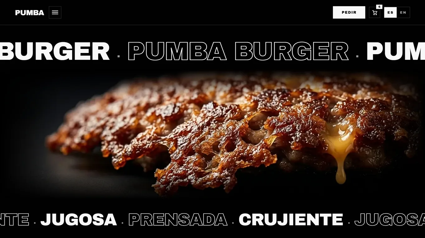
01 / 04·Home
Black and white, so the food brings the colour
Black, white and four greys: not a drop of brand colour anywhere in the interface. That one decision governs the rest — if nothing else has colour, the burger photography is the only thing that does, so it stops being decoration and becomes the structure of the page. Everything is square, not a single rounded corner, headlines mix solid letters with outlined ones, and the order button wins by inversion: a solid white block on black. Which is exactly why there cannot be three other white things around it.
The order survives closing the browser
Whatever has been built up is kept on the phone itself, so an incoming call, a refresh or stepping out to check where the place is erase nothing. The code is held for twenty minutes, and the time left is worked out against the actual clock rather than a counter ticking down in the background — which is why coming back half an hour later gives the right answer instead of a stopped watch. And the twelve menu photos, the only genuinely heavy thing here, are served at the exact size each screen asks for.
- 100Performance
- 98Accessibility
- 100Best practices
- 100SEO
- Next.js
- Tailwind CSS
- Motion
- Vercel
01 / 04·Diagnosis
«I used to answer the phone with one hand and hold the spatula with the other. Now they read me three characters and the whole order is already on the screen.»
Your menu doesn't fit in a phone call.
Taking orders by phone during the rush is the most expensive bottleneck a small restaurant has: someone leaves the griddle to pick up, the customer shouts the order over the noise, and everything arriving meanwhile is lost to an engaged tone. Delivery platforms do solve it — in exchange for a cut of every order and for keeping the customer.
A restaurant's own site does three things at once: it shows the menu with the photography that actually sells, it lets people build an order with its extras and allergens without anyone having to dictate them, and it closes that order with no middleman. The order arrives written down, the customer is yours, and there is no commission.
Design, development and performance are all ours, nothing subcontracted, and the site ships in weeks rather than months.