Tinta Studio
A studio with four artists and four styles that look nothing alike, all trapped in the same Instagram feed. We built a site that sorts the work by artist and by style, shows the photos big, and collects every booking request with the style, the artist and the size already in it.
- Client
- Tinta Studio
- Sector
- Tattoo studio
- Services
- UX/UI design, web development, animation
- Timeline
- 6 weeks
- Tech stack
- Next.js + Tailwind + Vercel
Measurable outcomes.
+0%
Fewer messages, more bookings
Everything used to come through an open message. Now it comes through a form that already captures style, artist and size: fewer conversations to filter out, more to book.
0.52s
The gallery shows up in half a second
Every photo is served at the exact size the screen asks for, and the cover video is recompressed with no audio track.
0 h/wk
Less manual admin
The catalogue answers on its own the questions that used to be repeated in every chat: who works in which style, what can be booked and how far ahead.
From the problem to the live site.
Tap each phase for the detail.
Problem diagnosis
Everything came in through direct messages. Four artists whose styles have nothing in common shared a single feed, so prospective clients could not tell who to ask for their tattoo and the studio retyped the same answers every day.
- User archetype
They arrive knowing the style they want, not the name of the artist who does it. Navigation had to start from style and lead to the person, not the other way round.
- Pre-filtering strategy
The site answers style, artist, size and placement before the first message, so the conversation starts at the booking stage.
- Home
- Artists
- Work
- Booking
Main heading
Headings: Anton
Body: Geist Mono

- Show sketches, not just finished work
- A space of their own for each artist
- It should read as a studio, not a template
Structure first, colour second
Before deciding on a single colour we validated the structure: what gets seen first, how much room the gallery needs and where in the scroll the booking button belongs. On the left, the sketch; on the right, what went live.
01 / 04·Home
Letting the photos stand out over a minimal style
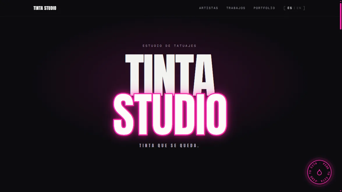
Minimal neon: a deep background, one single accent and plenty of air, so the photos compete with nothing. Animation follows the scroll instead of decorating it. Plus two pieces built from scratch: the ink that splatters across the screen, with its own physics of angle, force, spread and mist so no two splatters repeat, and a custom cursor that changes shape over anything you can click.
Optimisation and performance
A gallery-heavy site is a slow site by default — and a slow site gets closed before it opens. This whole phase was optimisation: every image weighing as little as possible, and the gallery loading as the visitor scrolls rather than all at once. The result: it opens fast on mobile data, outside the studio door, which is where it actually gets looked at.
- 99Performance
- 100Accessibility
- 100Best practices
- 98SEO
- Next.js
- Tailwind CSS
- Vercel Edge
- Framer Motion
01 / 04·Diagnosis
«We used to lose bookings among unanswered messages. Now people arrive already knowing who they want to be tattooed by, and all we do is give them a date.»
Your studio deserves better than a feed.
Instagram gives you reach, but it does not give you a website. You cannot sort the work by style, you cannot show each artist's portfolio on its own, and every booking starts from scratch in a direct message.
A dedicated site for a tattoo studio solves three things at once: it shows the work at the quality it deserves, it separates artists by style so each client finds theirs, and it filters enquiries before they land. That is time going back into the chair.
We handle design, development and performance ourselves, with nothing subcontracted, and the site goes live in weeks rather than months.